It has been three years since LOSE YOUR BROKER NOT YOUR MONEY was published. In that time the original 15-51 Indicator portfolio that is detailed in the book has produced a 67% gain, compared to a 42% increase for the Dow Jones Industrial Average. Those following along with these blogs know that the 15-51 strength indicator was changed and rebalanced at the end of 2011 (signified by a pink diamond in the below chart). This, of course, was a move made to bring the portfolio more into line with changes in “the market” that were inspired by the 2008 crash. The two 15-51 portfolios, though very different in make-up, have taken two completely different paths to ironically the same outcome: both have produced a 67% gain. Below is a chart showing the trend-line comparisons.
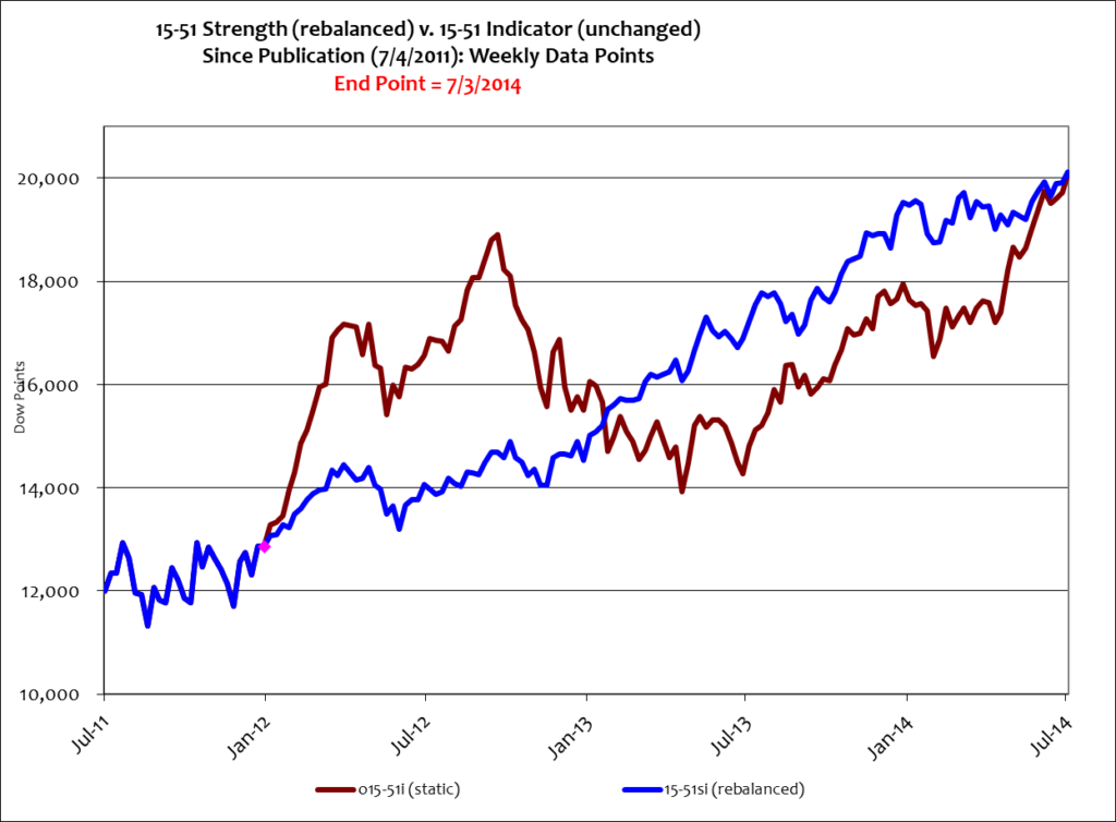
The red line shown above is the portfolio detailed in my book that has never been changed or rebalanced. It has fully recovered from its 2012 correction and is within inches of the updated and rebalanced 15-51 strength indicator. The turnaround of the original portfolio (and its correction for that matter) is basically due to the performance of Apple, which became a dominant part of the portfolio. Due to this imbalance the portfolio started to track Apple more than “the market” – and that wasn’t its objective. That’s the reason a rebalancing was required.
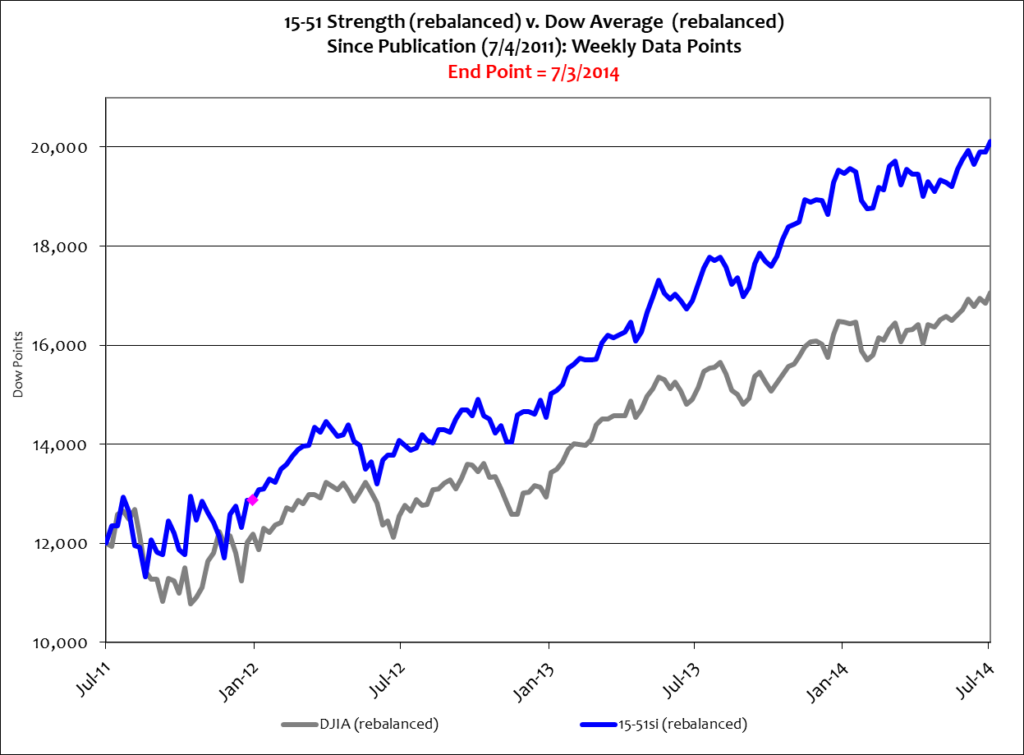
The 15-51 strength indicator is a portfolio designed and constructed to indicate stock market strength. It should, in theory and by design, produce above-average returns in a trend-line that closely mimics “the market.” Clearly the rebalanced portfolio produces returns greater than the DJIA, and in a manner more in tune with “the market,” as signified by the blue line in the above chart. The Dow, of course, is an actively managed portfolio that is routinely reconfigured and rebalanced. In fact, it has been changed several times since the 2008 market crash. Below is a look at just those two trend lines, the DJIA and 15-51 strength indicator.
It was just one month ago that the S&P 500 set a record high milestone by closing over 1,900 for the first time in its history. This month it’s the Dow turn; it closed over 17,000 for the first time in its storied career. And while that’s all fine and dandy, the 15-51 strength indicator also closed at a new all-time high, 77,270 – that’s 604% better than the Dow average since year ended 1995.
Pundits credited a “strong” jobs report for the 1+% surge in stock values last week. Approximately 288,000 jobs were added in June and the unemployment rate dropped to 6.1%, from 6.3% – yet the more accurate employment gauge, labor participation, remained unchanged for the third consecutive month. It’s still stuck at thirty year lows (62.8%).
Again, the employment picture hasn’t changed and won’t change until labor participation and wages begin to grow significantly. Such moves would produce steady economic growth – and that’s something we haven’t seen yet. That is to say the most recent stock market run-up is once again overblown and purely inflationary.
Nothing communicates this better than the eye-popping ascent of the 15-51 strength indicator since the ’08 crash. Take a look below.
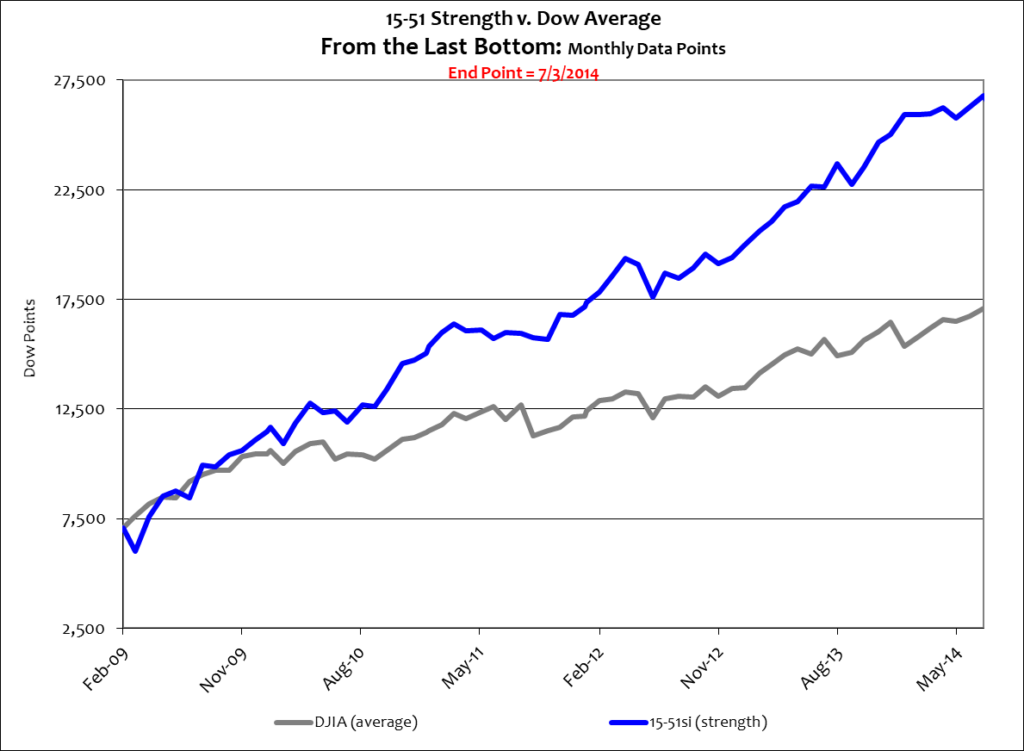
That’s what hyperinflation looks like.
Stay tuned…
![]()