Trading volume is generally light leading into holiday weekends and that was the case again last week. On the lightest trading volume so far this year the S&P 500 ended the week at a new all-time high, closing over 1,900 for the first time in its history. But even with recent achievement the S&P 500 has continued to underperform the Dow Jones Industrial Average since the internet appeared on the scene. Below is a chart showing the performance comparison between the two market averages since year ended 1995 when the tech boom essentially took root.
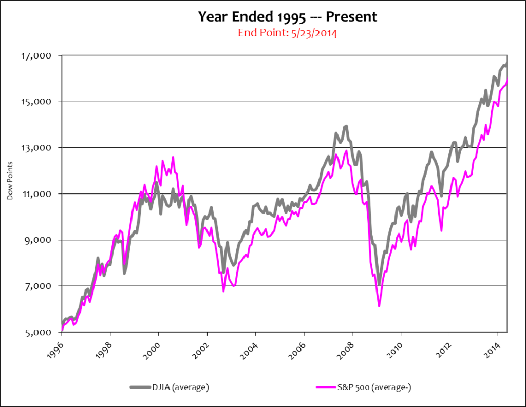
In the eighteen year period shown above the S&P 500 rose 207% and the Dow gained 223%. The S&P 500 averaged 11% per year and the Dow added 12% per. Both are respectable returns, indeed – but they are average nonetheless.
Stock markets overreact in both directions, up and down. In other words, they trade well above fair value in up markets and well below fair value during down markets. So the move from the March ’09 bottom to fair value in April ’11 was a totally expected move. The ’08 crash was indeed a serious condition; but there was little doubt that the event would cut the economy back to the levels of the 1980’s. That was in fact how it was valued at the March ’09 bottom. It was simply an over-reaction to the downside. It happens.
Today’s stock market is the opposite condition. Economic growth is stagnant, labor participation is at historic lows and declining, and according to FactSet earnings growth for the S&P 500 companies was just 2.1% in the first quarter – not a strong showing by any standard. Perhaps that is why stocks have only oscillated this year. But because stocks ended 2013 at historic highs, they continue to trade well-above fair value.
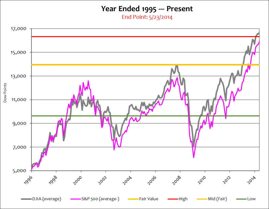
Stock market inflation and over-valuation can easily be misunderstood, misinterpreted, and miscalculated. The action zone helps clarify those ambiguities. Remember, the action zone is a range the Dow historically trades around. It is the average high, low, and mid point (fair value) the Dow trades as related to Nominal and Real GDP. Below is the same chart as the one shown prior except that includes the action zone and GDP.
Stock market portfolios like the Dow and S&P should always outperform the economy over the long-term. They’re smaller and more nimble, and are comprised of more powerful parts. But how much they outperform the economy, and why they are outperforming it, are the most important issues to consider.
An unprecedented amount of monetary stimulus has forced Nominal GDP and stocks higher simultaneously; making it look like an economic boom is underway. But that’s not the case. This is a smoke and mirrors stock market rally.
Real growth, that is growth adjusted for monetary inflation, has essentially flat-lined since the ’08 crash. In fact, the Dow is now trading at a higher multiple to Real GDP than ever before. The QE inspired money-boom caused that, as proven by the widening spread between Nominal and Real GDP.
In Market conditions such as these the stock market averages should be trading around fair value. The economy simply isn’t strong enough to qualify irrationally exuberant stock valuations. But these anomalies happen all the time, and as mentioned in my book, corrections usually follow prolonged periods of hyper inflation – and that’s what’s going on right now.
Sometimes it’s hard to see hyper inflation in the stock market averages because they’re so grossly manipulated by the Wall Street establishment. Perhaps the best illustration of this dynamic is with stock market strength – because that is where dollars flow most heavily when things get shaky. Below is the same chart as the one shown above except that it includes the 15-51 strength indicator, an above-average stock portfolio.
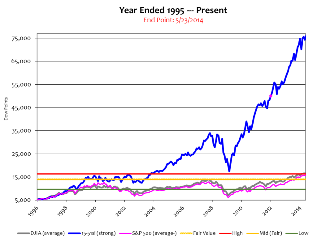
During this 18 year period 15-51 strength posted an amazing 1,352% return, or 74% per year – more than 6 times the rate of the Dow and S&P. Its amazing performance placed the chart on a completely different scale and pushed the stock averages down to their rightful place – close to Nominal GDP, the true market average.
So forgive me for not getting too excited about the S&P 500’s most recent record achievement; it is a valuation level the 15-51si first reached fifteen years ago.
And while the Dow and S&P may appear as “reasonable” or “slightly” elevated in this chart, don’t let that mislead you. The 15-51 portfolio highlights the incredible amount of inflation in the stock market – and like the market averages, is also over-valued.
Because the Wall Street establishment portrays “the market” as an impossible investment benchmark to reach many investors succumb to believing that they’re doing good because their portfolio is going up and not down. They cave to the mindset that beating the market is impossible and that earning less is good so long as they’re not losing. But that’s a false assumption. It is impossible to make money in the stock market long-term without consistently outperforming the market averages. Inflation, along with corruption and poor management from the Wall Street establishment, will steal what little profit is made. That’s the reality of the Wall Street proposition.
That’s why I say, Lose Your Broker Not Your Money.
It’s time to stop making them rich and yourself wealthy.
![]()