The investment markets are notorious for sending bombastic messages. They price daily and react to the whims of news and impulse – and speculation is the main driver. As a consequence the short-term (i.e. days, weeks, or even months) tells very little about the stock market’s condition or its future course. Nevertheless everything happens for a reason. Dramatic and/or erratic movements, whether short-term or long-term, should be seriously considered.
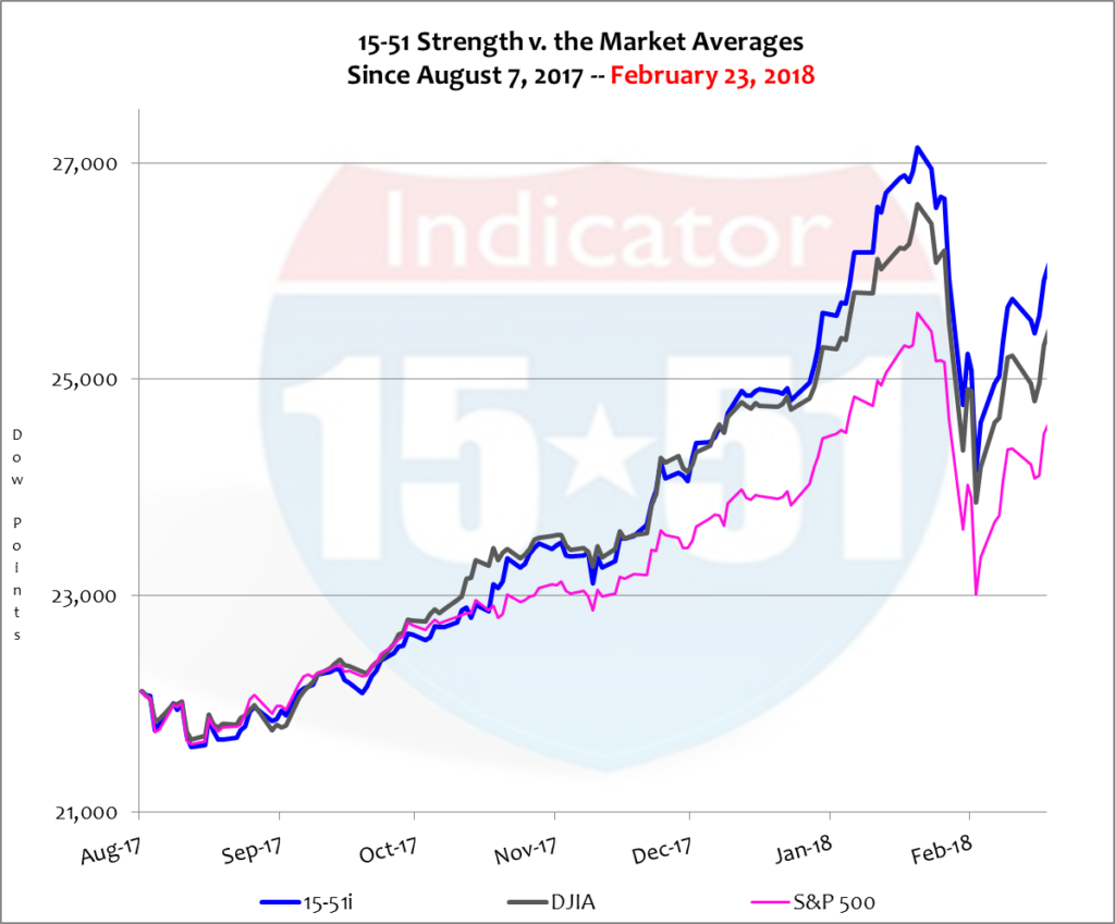
Many in the media have referred to the recent price adjustment as a “correction” as if that somehow classifies it as something much more than what it actually was. Price corrections happen all the time, every day, week, month and year. Indeed, a 10% move is substantial. Heck, ten-percent of anything is a significant portion. And to lose it in just 10 days is also significant. A short-term view of the downward correction looks as dramatic as it sounds. See below.


The chart above proves a few things. First, when the stock market sells-off all portfolios go down in a similar manner. The only way to escape it is to not be in stocks and the only way to mitigate it is to have a multiple asset class portfolio (see my book for more details.) Second, the chart and correction once again prove that smaller portfolios consistently outperform larger and more diversified ones in all market conditions (both up and down); they experience higher lows at the bottom; and they recover faster and more potently after the heat is gone. These dynamics, preferred by all investors, are the bedrock of my 15-51™ method.
Less is definitely best.
This is proven by consistent superior performance of the 15-51 Indicator™. In the most recent twelve months shown above, for example, the 15-51 Indicator™ gained 27% compared to 22% for the Dow Jones Average and 16% for the S&P 500 – after the most recent correction. Those are solid one-year gains. Extremely solid, in fact.
So what’s the big deal with the “correction”?
First, when stocks sell-off that quickly and sharply there is only one impetus to movement: panic. Second, the only way for stocks to fall that fast is for the Wall Street establishment – the market makers and institutional investors – to be the ones who are most panicked, first and foremost.
And why are they so jumpy?
Let’s first state the obvious: stock valuations remain ungodly high and the market dynamic is changing. All eyes are on the Federal Reserve and interest rate policy. The Trump tax cuts threw a wrench into current Fed policy – and a new chairman just took office. What will Jerome Powell do? He intends to maintain the Yellen plan but that plan didn’t account for the tax cuts. So how will he adjust?
Wall Street is unsure.
What the establishment does know, however, is that stocks are rich and have a lot to lose and bonds are poised to take a beating. Wall Street has a lot of action on the table, not to mention being caught-up in the hoopla of free and easy money for almost a decade. So they wake up on January 26 and notice the sharp move in the 10-year note. Oh my God, they panic, and sell.
On January 26, 2018 the yield for the 10-year note was up 10% for the year that was just a few weeks old. At that time stocks were fractionally off the same pace. The day before everything seemed normal – even though yields had been spiking since Trump won the election on his promise of steep tax cuts for all. Tax cuts had no choice but to raise yields and interest rates. Everybody “in the know” knows that, Wall Street most of all.
Not ironically Jerome Powell took the helm at the Federal Reserve on February 5, 2018 – a day that saw stocks lose 4.4% in value. Welcome to office, Mr. Powell, with warm regards from your friends on Wall Street.
At the time of that January 26 fulcrum stocks lost ten percent and yields added another ten percent on top of the first ten already earned. They’re up 20% so far this year, and they are going to go higher. Wall Street knows this too. After all, the Yellen plan called for three interest rate hikes in 2018. But is that enough? If not, how big will each one be? And what will it do to stocks?
Speculation is the gasoline to panic’s fire.
Scared at the possibilities and potential outcomes Wall Street took some chips off the table and recalibrated their portfolios. This move, no doubt, was to offset losses in their bond positions. Yields and bond values run in opposite directions – and the establishment owns a ton of bonds, thanks to QE (quantitative easing.)
Investors should expect more of this kind of action because interest rates are still historically low (the 10-yr closed Feb. 23 at just 2.87%) and free market trading is pushing them higher without Fed intervention. This is concerning because QE inflated an asset bubble in the stock market and the effort to unwind it is just starting to begin; logic dictates that unraveling the effort will have the opposite effect as its implementation: this time yields will move higher and stock prices will adjust lower.
Again, this isn’t new news. Wall Street was just doing what they do and sending messages as they did it. These high valuations have them nervous and the future is uncertain. One thing is for sure, however, should the unwinding effort go awry they will blame Jerome Powell and Donald Trump in the same breath.
But the scariest part of this situation – the thing that has Wall Street panicked more than anything else – is that it is getting more and more likely that yields will runaway from the Fed because they can’t move fast enough – and then all hell will break loose. Uncontrollable yields make everything harder. They are impossible to predict and their consequences are impossible to calculate – especially when considering the QE ponzi scheme on a global scale.
That explains Wall Street’s itchy trigger finger.
It also shouldn’t be discounted that sharp sell-offs are a great way for Wall Street to take the temperature of their customers – investors who rely on them for guidance and advice – who are sure to call during a two-week mayhem of trading. Normal fluctuations are just that: normal. “Corrections” on the other hand are big and bad enough to draw their consumers in. They provide great incentive.
Already there is speculation as to whether the recent “correction” will create, or morph into, a Bear Market and recession. The stupidity of such banter drives me nuts.
For instance, it is widely broadcasted that a stock market doesn’t experience a “correction” until it is down 10% from a previous high, and that a “Bear Market” doesn’t ensue until a 20% loss is incurred – regardless of time duration and Market condition. Such a mindset is totally baseless and nonsensical.
Consider that the conventional definition of a recession is an economy that shrinks for two consecutive quarters, or six consecutive months. Time duration is a critical factor in the calculus to exclude normal anomalies that can happen at any given time, month or quarter. Yet no such standard applies to the stock market.
Using that same flawed logic a stock market can totally transform from a Bull Market to a Bear in just a single day of trading, which happened on Black Monday, October 19, 1987, when the Dow Average lost 23%. To think that a market can completely change status or condition in just one day is absurd.
A Bear Market is when stocks lead the economy lower. But the economy was growing steadily in all of 1987 and 1988. Black Monday was a correction, not a Bear Market. Size doesn’t matter (sorry couldn’t resist).
It is equally ridiculous to believe that a 5% drop over a six-month period isn’t a correction, and that a 10% loss over the course of a year is not a Bear Market should the underlying economy be in recession or moving into recession.
My advice to investors: don’t get caught up in meaningless labels with flawed definitions like “corrections” and “Bear Markets.” They are just waffle.
Five things are for sure. Price corrections happen all the time; they happen for many different reasons; and they all come in different shapes, sizes, and time durations; context is key — and the establishment is corrupt.
Let’s put the recent corrective movement into proper perspective…
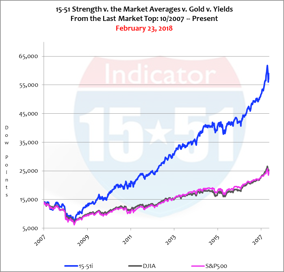
First, stock market cycles are measured not in days, weeks, or percentages, but in periods from the last market top to the present price valuation, or from the last market bottom to the current value. Logic dictates that a Bottom-to-Bottom perspective is most helpful when analyzing the cycle at pricing bottoms. When evaluating toppy markets a Top-to-Top view is appropriate. That’s what we are going to look at today. Below is a Top-to-Top chart that compares the stock market averages from October 2007 (the peak of the housing-boom) until present, Feb. 23. Take a look.


Let your eyes be immediately drawn to the end of those trend-lines – the 2018 correction. The ten-percent move doesn’t look so big and bad now, does it?—A steep sell-off indeed, but no big deal in the grand scheme of things.
The stock market Averages (Dow & S&P) gained 70% during this timeframe, or 8% per year. Solid returns for a lethargic economy. In fact stocks have been in a prolonged Bull Market since the last correction, rising some 300% since its’ bottom, or 33% per year. And since recovering from recession in 2010 stocks have gained 133%, or 17% per year.
Stock prices have been on an absolute tear. In fact the stock price multiple to GDP has never been higher than it is today – higher than the tech-boom or housing-boom. Put it all together and it’s easy to understand why Wall Street is so edgy. Valuations are rich, yields are rising fast and will continue, Powell is new and so are the tax cuts, QE is ending, and the worst is yet to come – and Wall Street knows it.
The most recent ten-percent downward move was just an adjustment, noteworthy only because of its size and speed – but nothing earth shattering. In fact, corrections do not become significant until they break a long-term trend-line or moving average. Such a breach would indicate a change in the direction of stock prices. But that hasn’t happened yet (refer to chart above).
For further proof of this rationale consider that when the recent sell-off took place the Dow Jones Average was up 28% in the most recent twelve months, and at the bottom of the current correction was still ahead by 15%. The “correction” only took a piece of the gain back, leaving a healthy one-year return. So what’s the problem?
This should be considered normal volatility for the current market conditions.
Many investors don’t appreciate the massive amount of price inflation currently present in the stock market today. That’s because the Dow Jones Industrial Average and S&P 500 are two of the most manipulated portfolios in the world – this because they are so widely followed and held. That makes it easy for the Wall Street establishment to choreograph large blocks of trade to affect key stock components to drive market indexes to portray a condition or trend that aids them in achieving one of their many objectives. For that reason the stock market averages do not represent an accurate picture of the true state of inflation currently residing in the stock market.
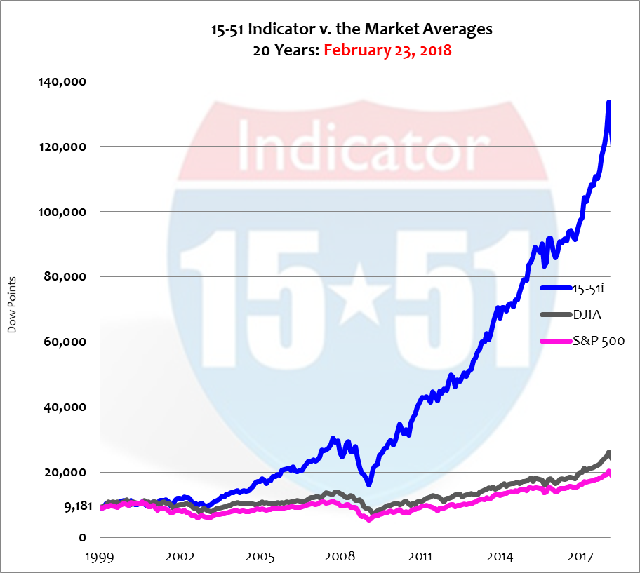
This is not the case with my stock index, the 15-51 Indicator™, which is not on the big board and doesn’t have an ETF. For this reason it escapes the manipulation ever present in the major market indexes. Below is a chart of all three stock market indicators over a very long period of time, 20 years. Take a look at the upward move in my portfolio compared to the averages since the last major correction. It accurately represents the gross level of inflation in the stock market today.


Stocks have a lot of ground to lose.
The next major correction – one that is caused by something major and real and not pure speculation that arose from thin air – is one that will make a 10 point move seem like a walk in the park without the knowledge of a ferocious bear lurking in the woods beyond.
Investors beware.
And stay tuned…

