The recession that inspired the 2008 financial crisis feels like a lifetime ago, its subsequent expansion now more than a decade along. Since recovering from the Great Recession back in 2010 stocks have enjoyed the longest uninterrupted expansion in history, featuring boom-like returns during the slowest pace of economic growth since World War II. The QE-boom, as it should become known, was a time driven by the greatest expansion in monetary supply the world has ever witnessed.
Slow growth, fast money, and bad policy are an inflationary threat capable of shaving 40% from this stock market in a time that makes it seem like it happened yesterday. It is over-valued, highly inflationary, and its economic base is quickly deteriorating.
Thanks to a decade’s long abuse of a cocaine called quantitative easing (QE), the next stock market correction will be a horrendous one because the stock market has never been this inflated with so much fake money before – especially with an economy in shambles and a completely dysfunctional political system.
Appreciating the level of inflation in the stock market and why it is important are central themes to this discussion.
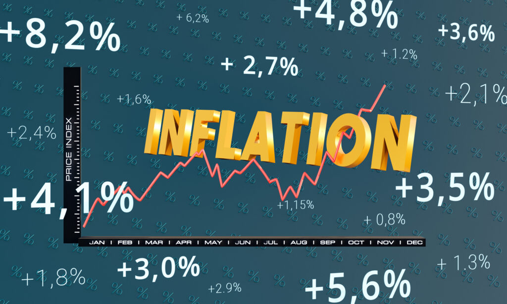
Illustrating Economic Inflation
The total market economy is measured by Gross Domestic Product (GDP), which represents total market activity for all market-segments in a territory, like the U.S. It is measured in today’s dollars, called Nominal GDP, and in Real terms, after inflation.
During the QE-boom (12+ years) the economy increased 64% in Nominal terms and 29% in Real terms (after inflation). The spread between the two (35%) roughly translates to an average inflation rate of 3% per year. The invisible tax that inflation is can be appreciated in the space between the two green lines in the chart below.
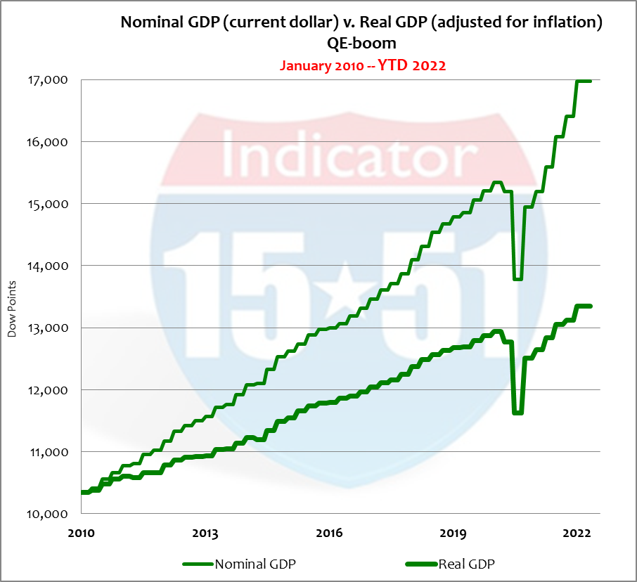
The gap between the two green lines of GDP illustrates how inflation is measured by market activity. Their widening separation is indicative of inflation’s rising condition.
Because inflation averaged 3% per year during the QE-boom, and Real economic growth averaged just 2%, Nominal growth therefore averaged 5% per year.
The inflation condition in stocks is much more severe.
Determining Stock Market Inflation
First let’s define the “Market Average”…
As you may know, the Dow Jones Industrial Average (DJIA) and S&P 500 are two stock portfolios that aim to indicate the general direction of stocks. To do so they seek average gains derived from allocations that mimic the market distributions of GDP.
The market averages, therefore, attempt to show investors what the publicly-traded version of the economy looks like. Hence the reason so many people call the stock market, “the market.” See below.
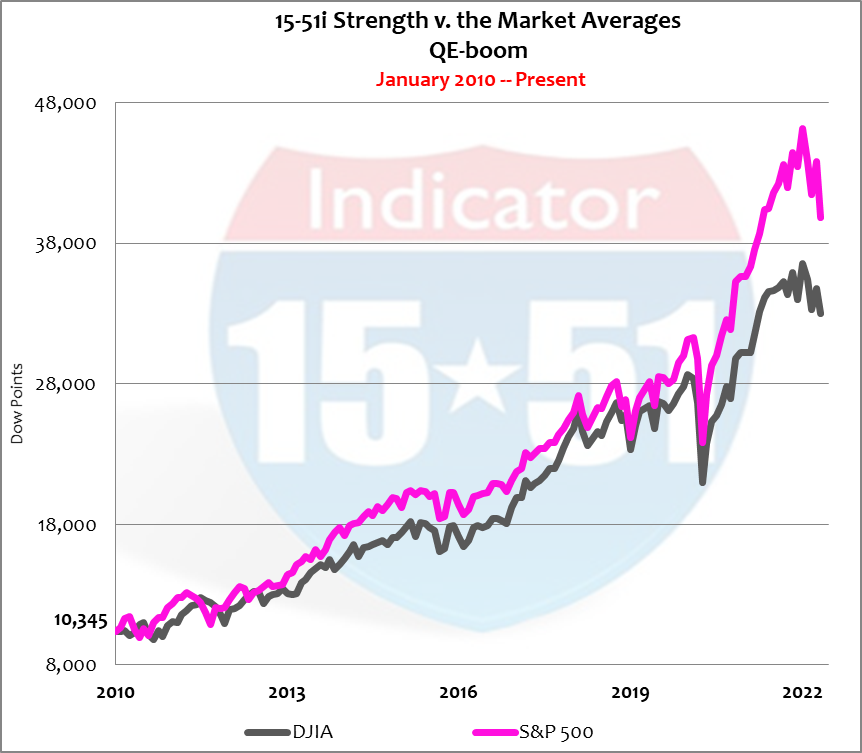
But because there are two market indexes that produce different returns, we will use the average of the two to serve as the true Market Average. See below.
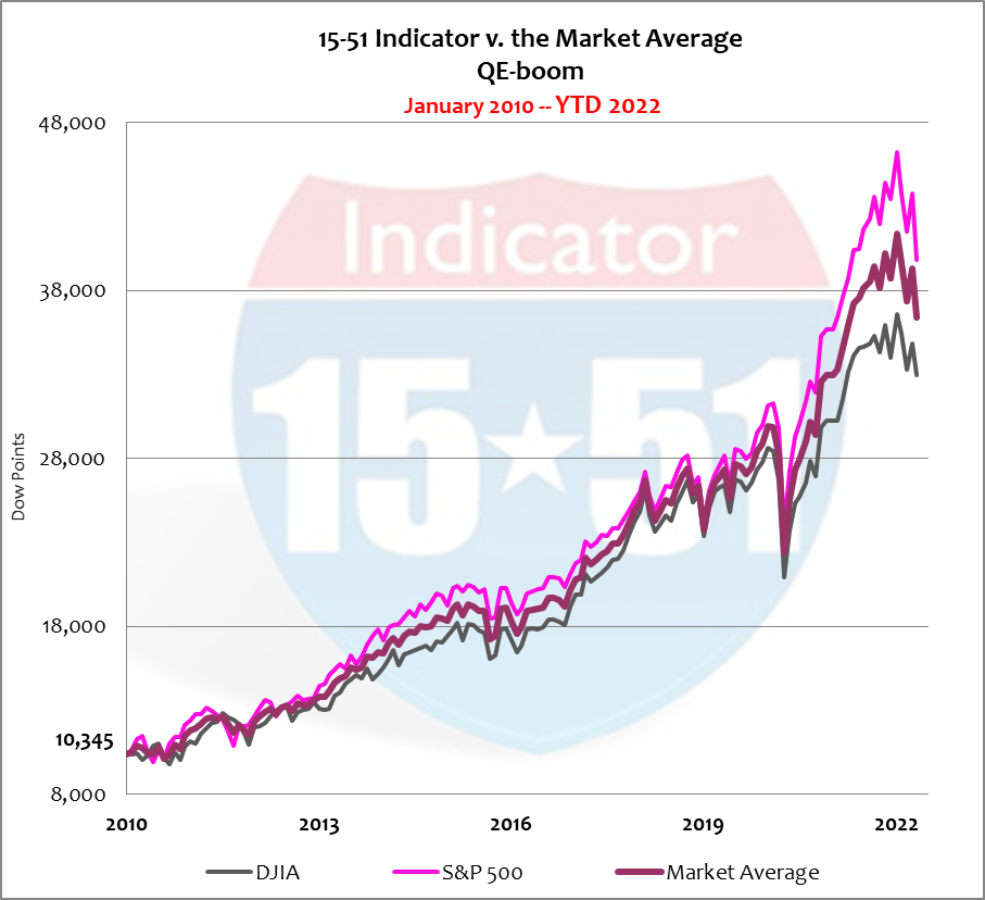
Since 2010 the S&P 500 has outperformed the DJIA 285% to 219%, respectively. The Market Average is nestled in between at 252%, or 20% per year, signified by the reddish-purple line in charts.
To better appreciate the current level of inflation in stocks it is helpful to compare the Market Average to a stronger performing market portfolio, like my 15-51i™ strength indicator, which is a market portfolio that consistently produces above-returns. During the QE-boom 15-51i™ Strength produced an amazing 470% gain, or 38% per year. See below.
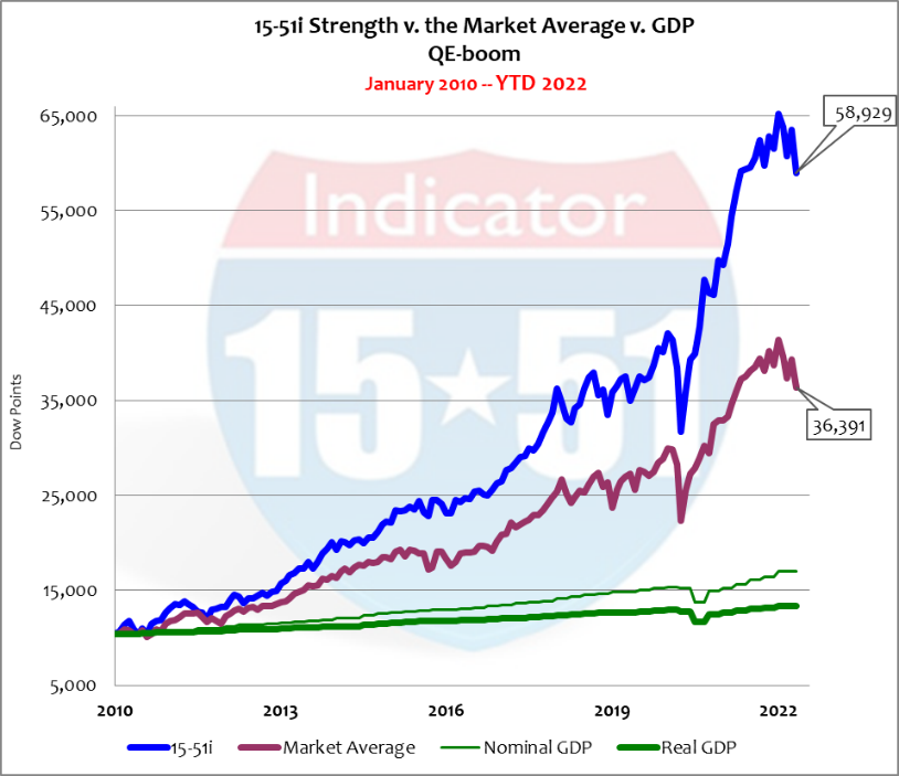
To calculate stock market inflation in a way similar to GDP we will use 15-51™ as our Nominal stock market gauge (38%) and the Market Average to represent Real stock market activity (20%). Their difference produces an inflation rate of 18% per year.
And what was responsible for that serious level of inflation?
Bad government policy financed by QE.
Qualifying Stock Market Inflation to Economics
Recall from above that the S&P 500 outperformed the DJIA during the QE-boom, producing annual returns of 23% versus 18%, respectively. Above we determined an 18% inflation rate for stocks – which equates to the actual rate of return for the DJIA. In other words, the DJIA produced zero return in Real terms during the highly inflationary QE-boom.
The higher-performing S&P 500 market index produced a Real return of just 5% – exactly the rate of growth in Nominal GDP, and marginal at best.
Takeaway Point: Investors must consistently outperform the Market Averages to accumulate Real wealth – like the 15-51i™ Strength Indicator, for example, which produced a Real return of 20% per year (38% return minus 18% inflation) – which equates the gross return for the Market Average.
Coincidence or phenomenon I’m not exactly sure, but because these metrics tie back and forth to GDP and the Market Average, support the idea our inflation rate is reliable.
Why is this Important?
Determining the amount of abnormal price escalation in stocks can help appreciate the amount of worth that can disappear in a moment’s notice.
That’s how the stock market can swing wildly in 10% increments in either direction like it’s no big deal – because it isn’t. After all, there’s a hefty rate inflation already baked into the trading range. That is to say stock market corrections or Bear Markets don’t get serious until 18% is taken off the table.
And there is plenty of room to fall beyond that.
Inflation is One Thing, Over-valuation is Another
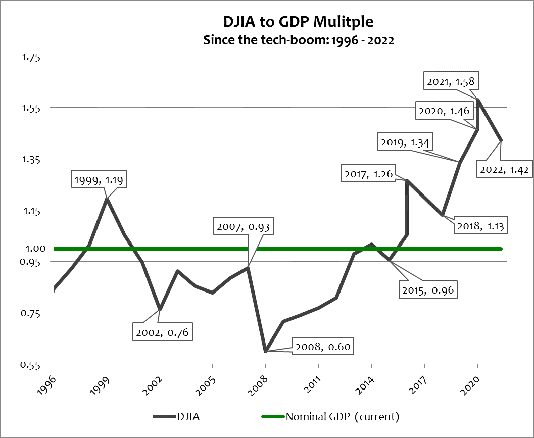
Knowing that speculation drives stock market values it is also helpful to appreciate that the DJIA continues to trade 36% higher (twice the inflation rate) than its average market multiple (see chart below). Shedding that excess would place the Dow’s point value around 23,500 (from 33,000 today). And should the next major recessionary crisis trigger another worldwide panic (count on it) the Dow could trade at its low market multiple, or 11,650 (not a typo), or lower. So if those possibilities aren’t factored into your strategic plan it’s time to recalibrate.
Making Money from Inflationary Bad Policy
Inflation is derived from bad management (in both monetary and fiscal policies) whether in government or in business – as good management produces more with less, and bad pays too much for too little. The latter typifies American governance today.
For almost two decades the answer to everything has been bigger government and more spending financed by printing more new money via QE. The money, without exception, was used by government to buy power and take control of industry through corrupt legislative action – which is incredibly inflationary and readily visible in stocks.
And there’s no better example of this than in healthcare.
You may recall the Affordable Care Act (a.k.a. Obamacare) was signed into law in March 2010 and then immediately challenged in federal courts. It took a few years to shake-out there, at which time SUPREME LETDOWN was posted in 2012 with my conclusion, “The “healthcare boom” begins today – and that includes price inflation – and will continue until another major fiscal crisis erupts.”
The basis for that prediction became obvious after reading the law – it had nothing to do with making healthcare affordable or more assessable to more people. Instead it was about paving the way to a single-payer system where government controls medical decisions, treatments and protocols by providing escalating need-based government funding, higher deductibles, individual mandates and penalties. Obamacare began implementation in 2014.
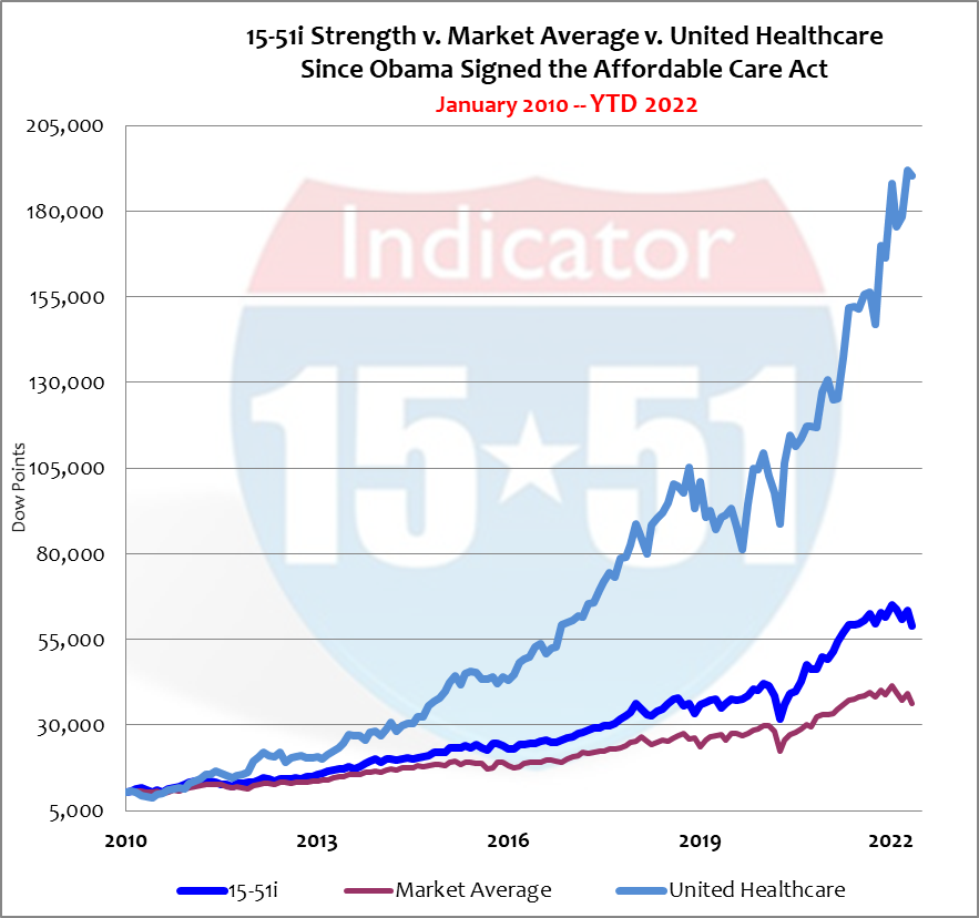
Shortly thereafter, in March 2015, United Healthcare was added to my 15-51i portfolio to capitalize on the inflationary effect of Obamacare and to adjust my allocations to reflect the changing “market” condition. At that time the stock price for United Healthcare (UNH) was $118 per share (today it is $500 per share). See chart below that compares United Healthcare to the Market Average and 15-51i™ Strength.
Talk about inflation…
United Healthcare has gained a whopping 1,740% since Obamacare was signed into law. Remember, 15-51i™ strength returned 470% during this same time. (See: THE FAILURE OF OBAMACARE IN ONE STOCK, for more info, and GRUBER ACKNOWLEDGES SUPREME LETDOWN.)
Obamacare was good for big business and bad for the little guy, as premiums rose in the face of falling medical costs.
Proof
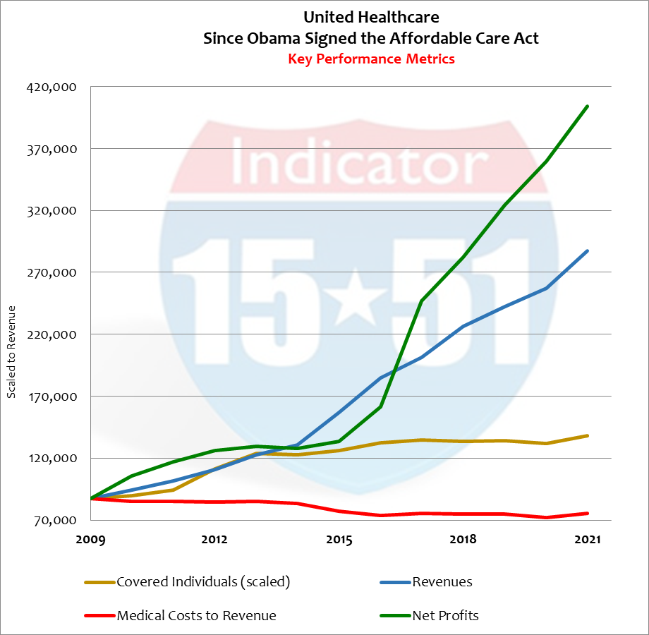
According to UNH’s public filings its revenue growth averaged 10% per year while their number of covered individuals increased by only 3% since Obamacare was ratified. In other words, revenues were growing three-times faster than their number covered, meaning more people were paying more for less coverage (and increased deductibles).
Add to this an excessive government subsidy program and the result is a flood of new money injected into the health insurance system – a highly inflationary condition to say the least.
Which can be very profitable for business, proof of which can be appreciated by the fact UNH’s medical costs went from 75% of revenue to 65% – in other words, higher premiums were garnered in the face of lower medical costs. This profitable dynamic produced 495% more in net profits for UNH during the QE-boom. (Data source: EDGAR). See below.
Obama took a broken system and destroyed it with inflationary big government and corruption while lining the pockets of his big business partners (the donor class).
That’s your government working for – who?
While it may be impossible to fight city hall it is tactically easy to profit from it. Following the money through the legislative maze is a tried-and-true method that never disappoints. United Healthcare was a buy from the word go.
Good management capitalizes on bad government policy and smart investors invest in them.
Investors should keep their eyes open for new opportunities because Biden is attempting to do to the energy market what Obama did to healthcare – pave the way to government takeover, which includes overreaching executive policy and legislative action that causes hyper-inflation (now in progress). Conditions like these cause recessions and always trigger major stock market corrections.
Prepare your portfolio now and let me know if you want to talk strategy.
Stay tuned…
![]()